


BEHIND THE SCENES: SS26 CAMPAIGN
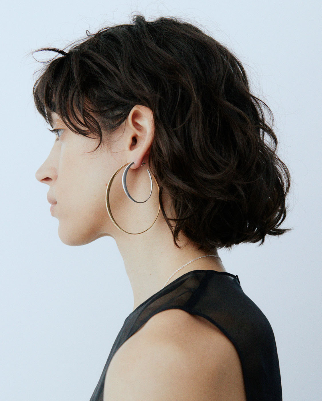
In its most unapologetic campaign to date, KINRADEN steps fully into its identity as a unisex jewellery house.
Cool, graphic, and quietly sensual
The new imagery captures more than aesthetics - it reflects the brand’s deeper architecture of values: sustainability without compromise, elegance with edge, and design rooted in art, architecture, and community.

A turning point for KINRADEN
A campaign that does not simply feature unisex jewellery, but declares it foundational. Every line, every material - recycled 18K gold, Sterling silver and FSC-certified Blackwood diamonds - is a reflection of KINRADEN’s commitment to integrity and innovation.

“The visual language is graphic, cool, and stripped to its essence. Think structure over ornament. A sensual minimalism that speaks to both strength and softness - without assigning either to gender. We wanted to create images that felt architectural, sculptural, even confrontational at times. Because we believe jewellery should be more than decorative. It should be a way of showing up in the world.”
- Christina Neustrup Brand Director

A thoughtful rebellion
With sharp silhouettes and stripped-back styling, the visual language is bold but considered. It's a rebellion, yes - but the thoughtful kind. Built not on noise, but on substance.

We hope that KINRADEN can continue to rewrite what jewellery can be. And for whom.
With Love,
KINRADEN